Refinery
Refinery
A REFINED RIVERSIDE WORKSPACE
PROPERTIES WITH
A POSITIVE IMPACT
PROPERTIES WITH A POSITIVE IMPACT
PROPERTIES WITH A POSITIVE IMPACT
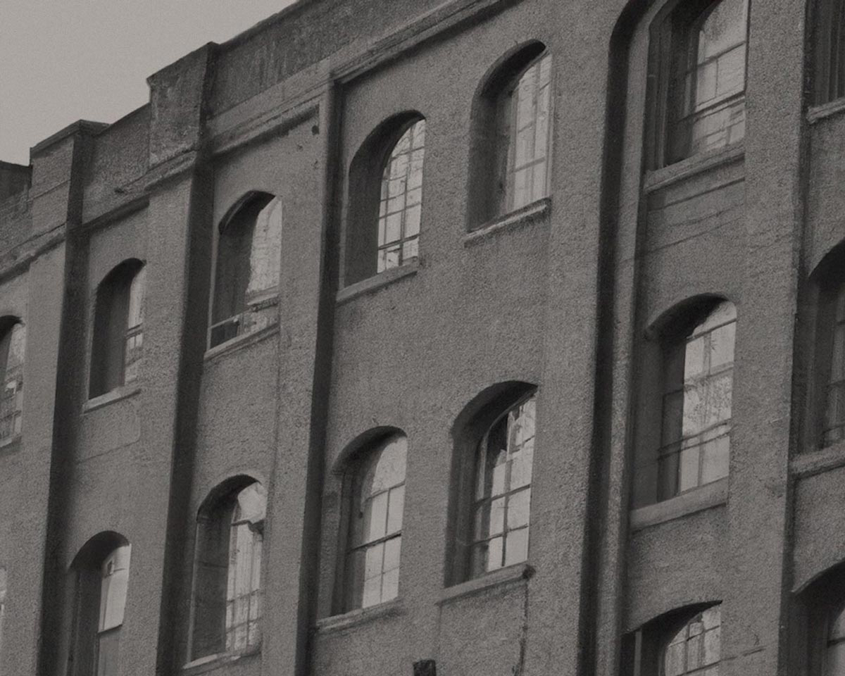
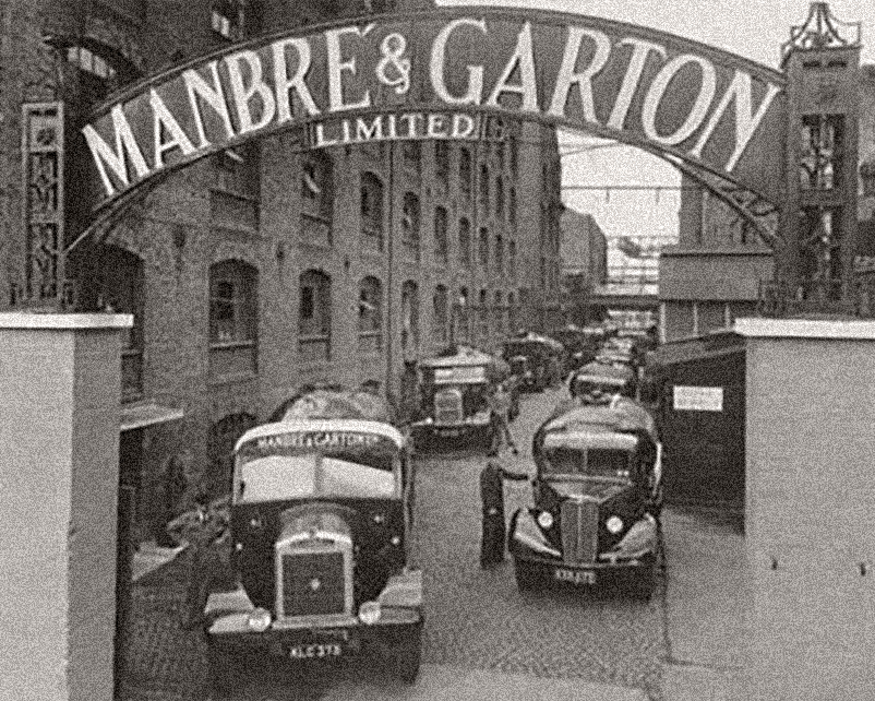
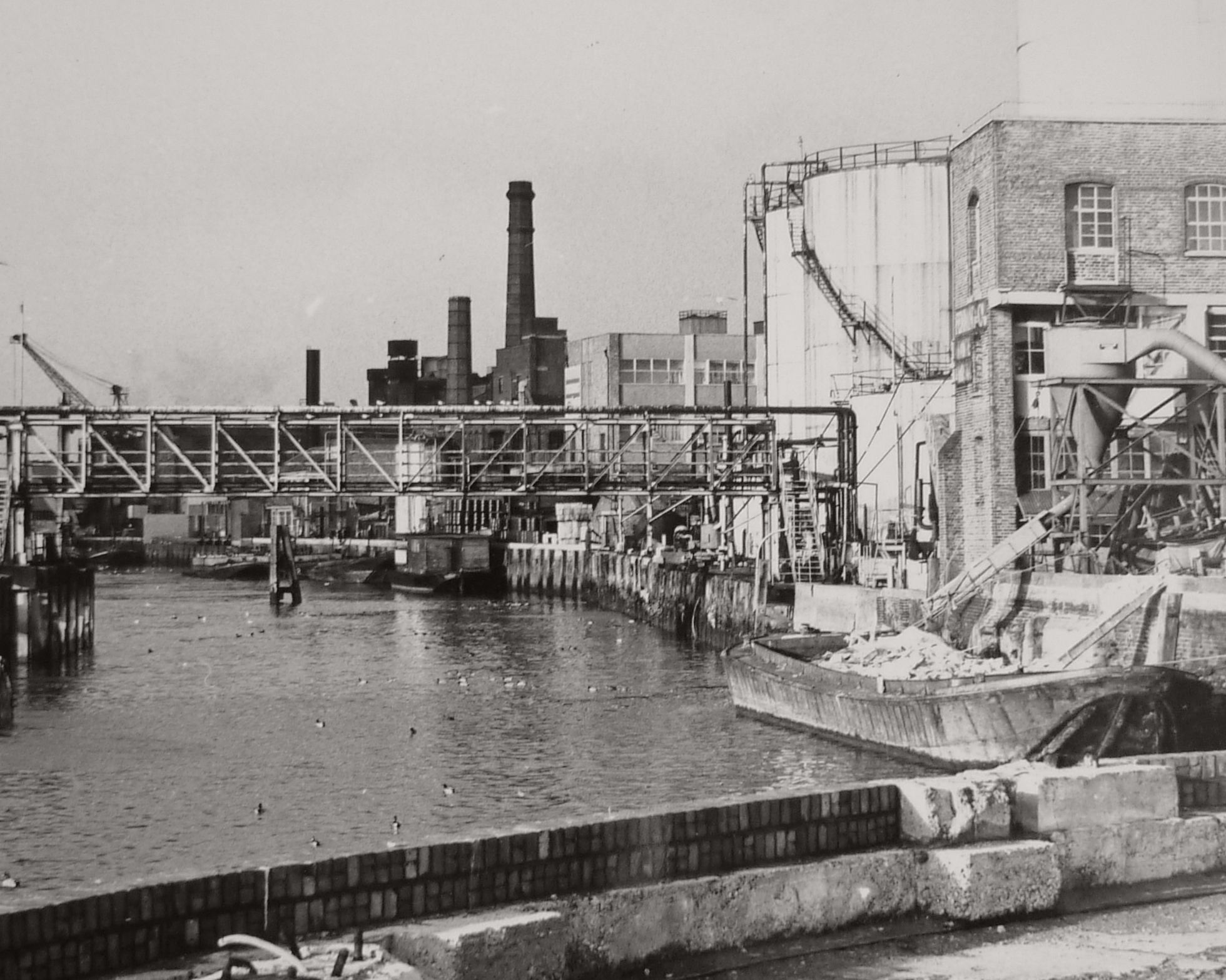
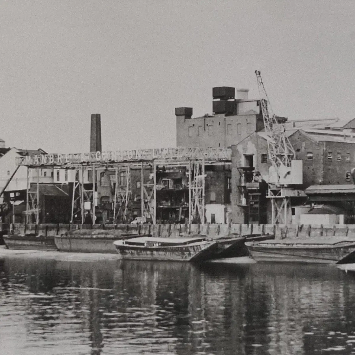
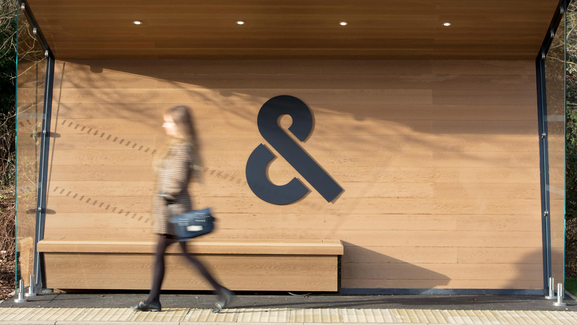
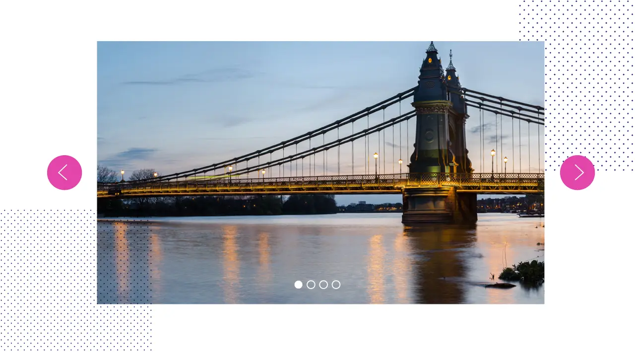
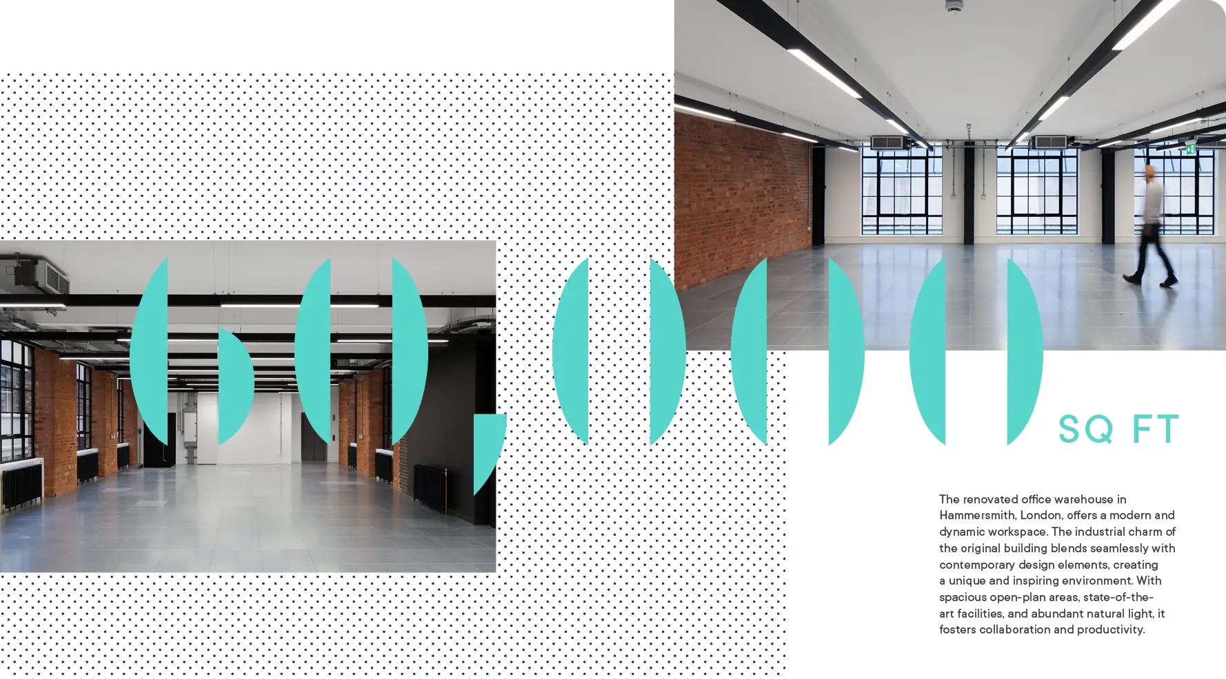
For more than a century this prestigious site on the banks of the Thames in Hammersmith was home to the Manbré & Garton sugar refinery. Disused for many years the site recently has been rennovated, turning the main refinery building into a workspace fit for 21st century business while also honoring the architectural heritage of the original buildings. This rennovation process was itself a form of refinement and formed the cornerstone of my identity's concept.
For more than a century this prestigious site on the banks of the Thames in Hammersmith was home to the Manbré & Garton sugar refinery. Disused for many years the site recently has been rennovated, turning the main refinery building into a workspace fit for 21st century business while also honoring the architectural heritage of the original buildings. This rennovation process was itself a form of refinement and formed the cornerstone of my identity's concept.
For more than a century this prestigious site on the banks of the Thames in Hammersmith was home to the Manbré & Garton sugar refinery. Disused for many years the site recently has been rennovated, turning the main refinery building into a workspace fit for 21st century business while also referencing the heritage of the buildings original use.
For more than a century this prestigious site on the banks of the Thames in Hammersmith was home to the Manbré & Garton sugar refinery. Disused for many years the site recently has been rennovated, turning the main refinery building into a workspace fit for 21st century business while also honoring the architectural heritage of the original buildings. This rennovation process was itself a form of refinement and formed the cornerstone of my identity's concept.
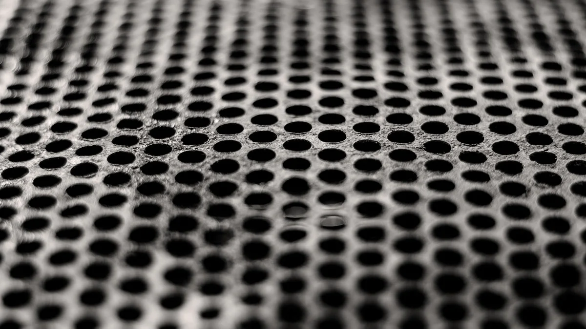
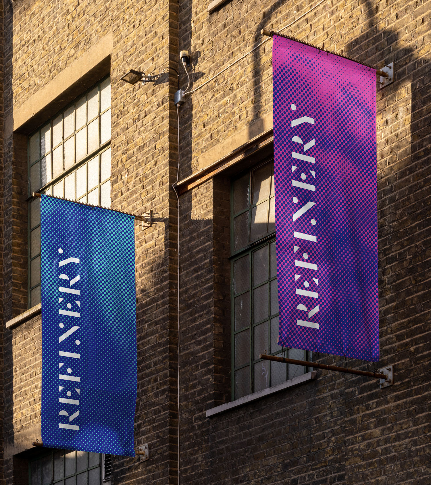
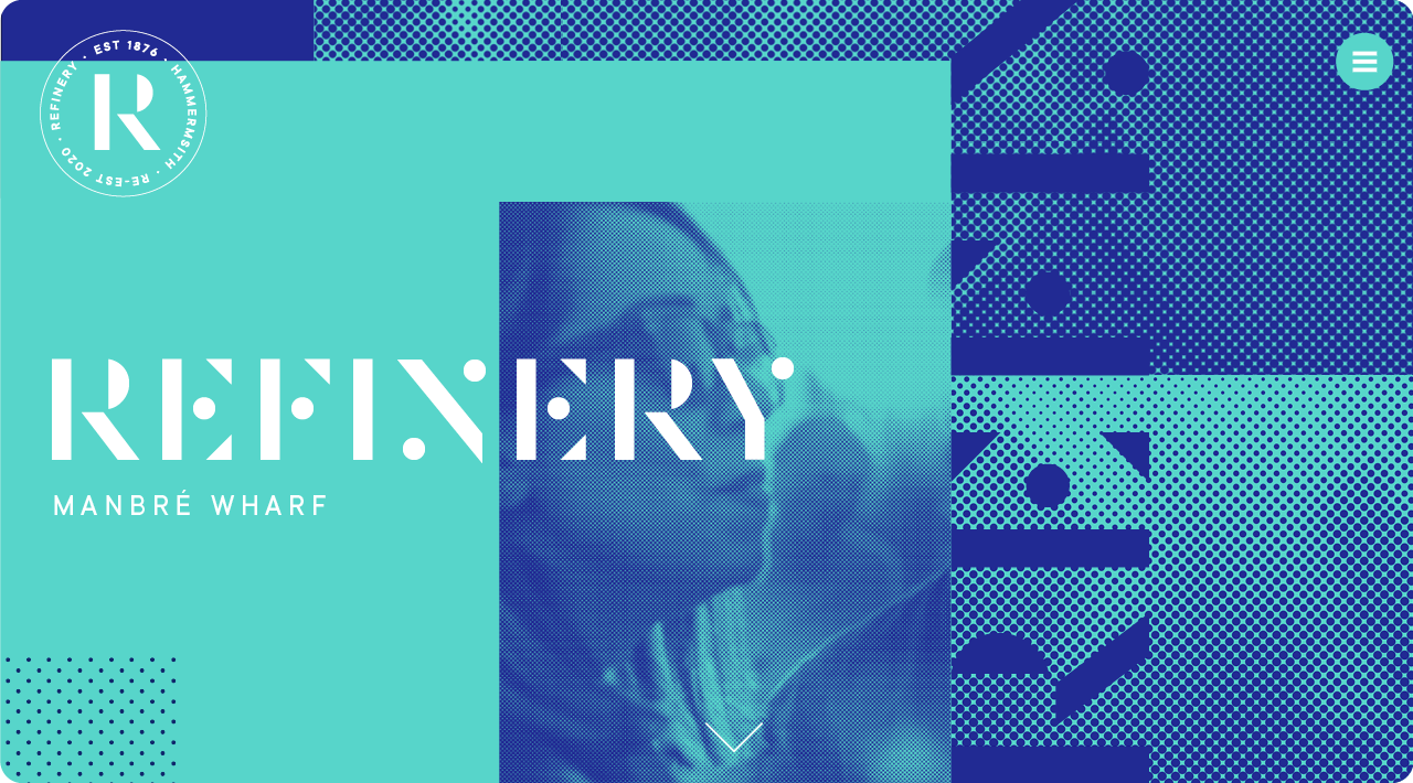
Halftone patterns reference metal perforated meshes used in the original refinery process. When animated these take on an almost water-like appearance.
Halftone patterns reference metal perforated meshes used in the original refinery process. When animated these take on an almost water-like appearance.
Halftone patterns reference metal perforated meshes used in the original refinery process. When animated these take on an almost water-like appearance.
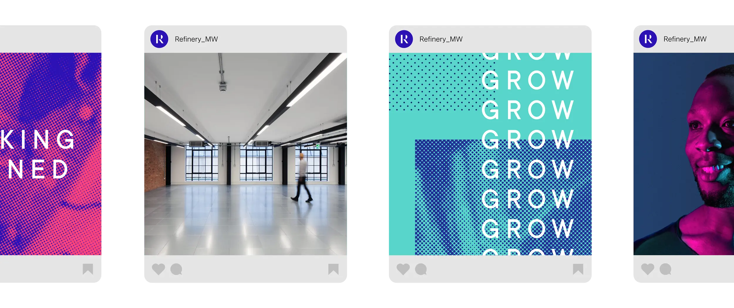
To support the ripple graphic elements I also developed a system for writing topline messaging inspired by the theme of transformation

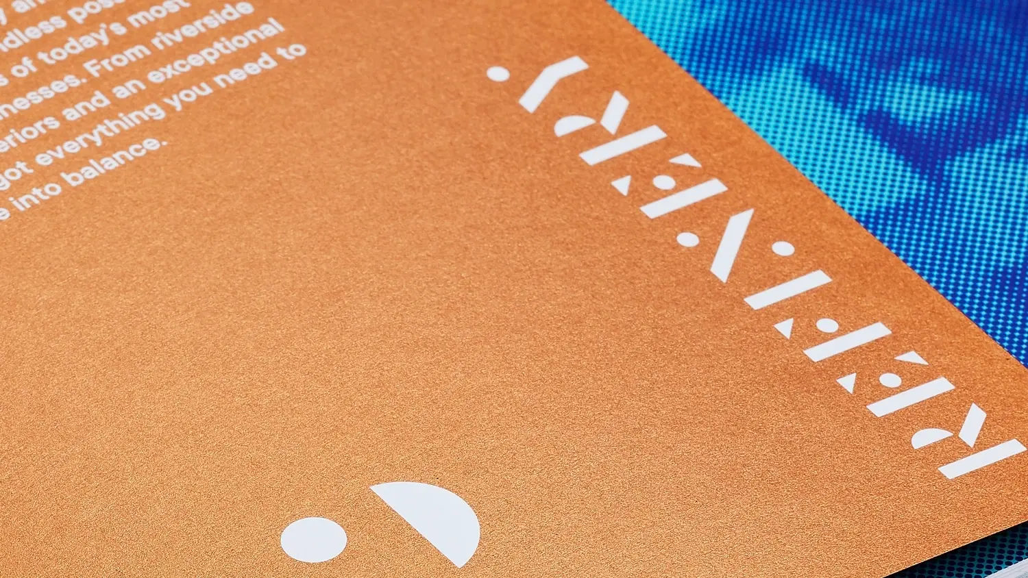
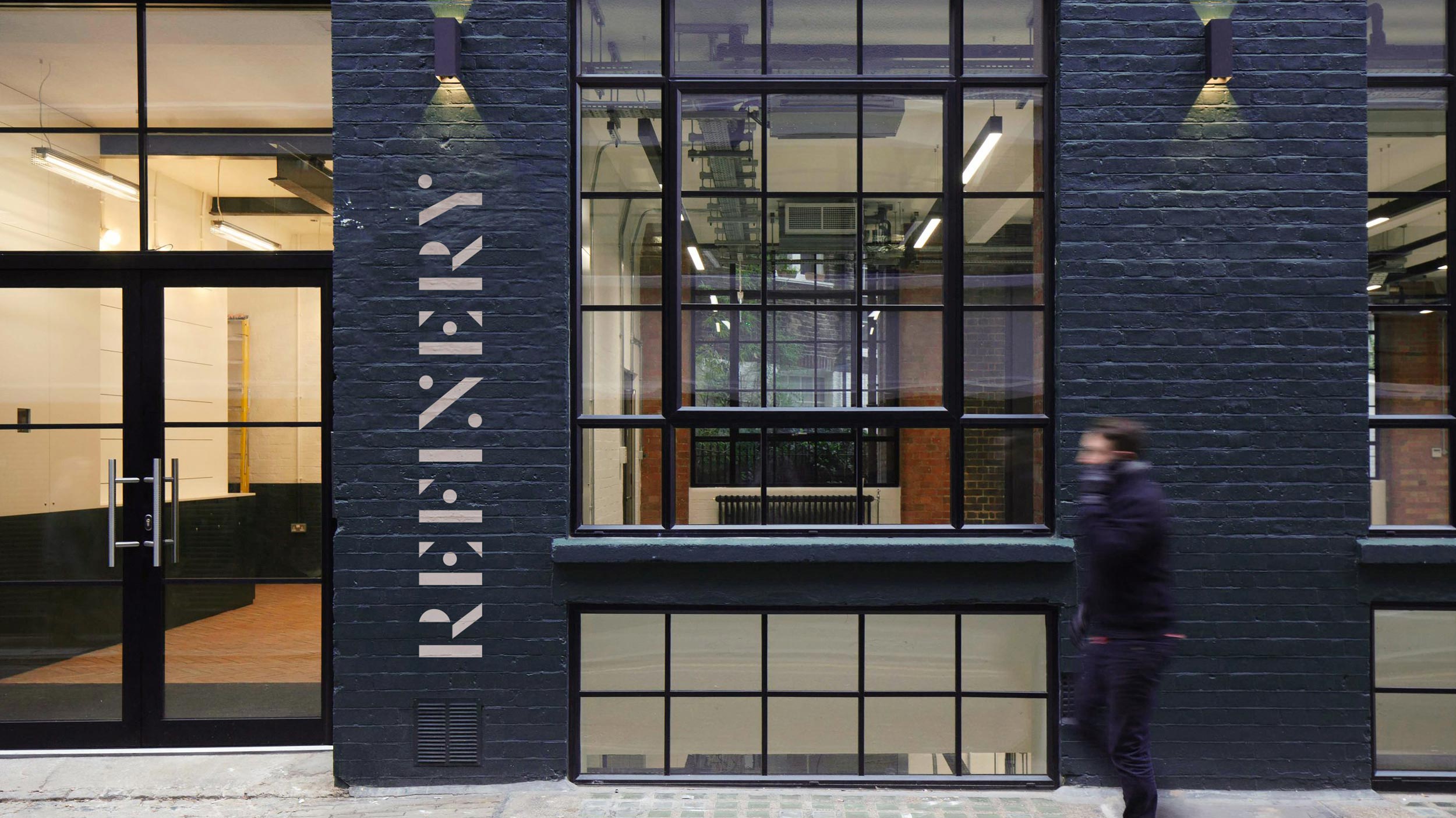
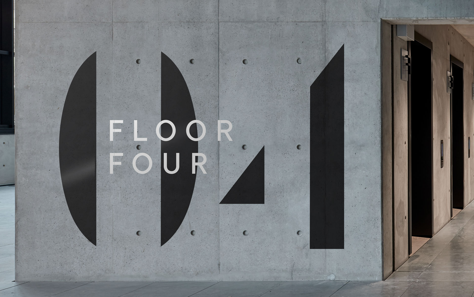
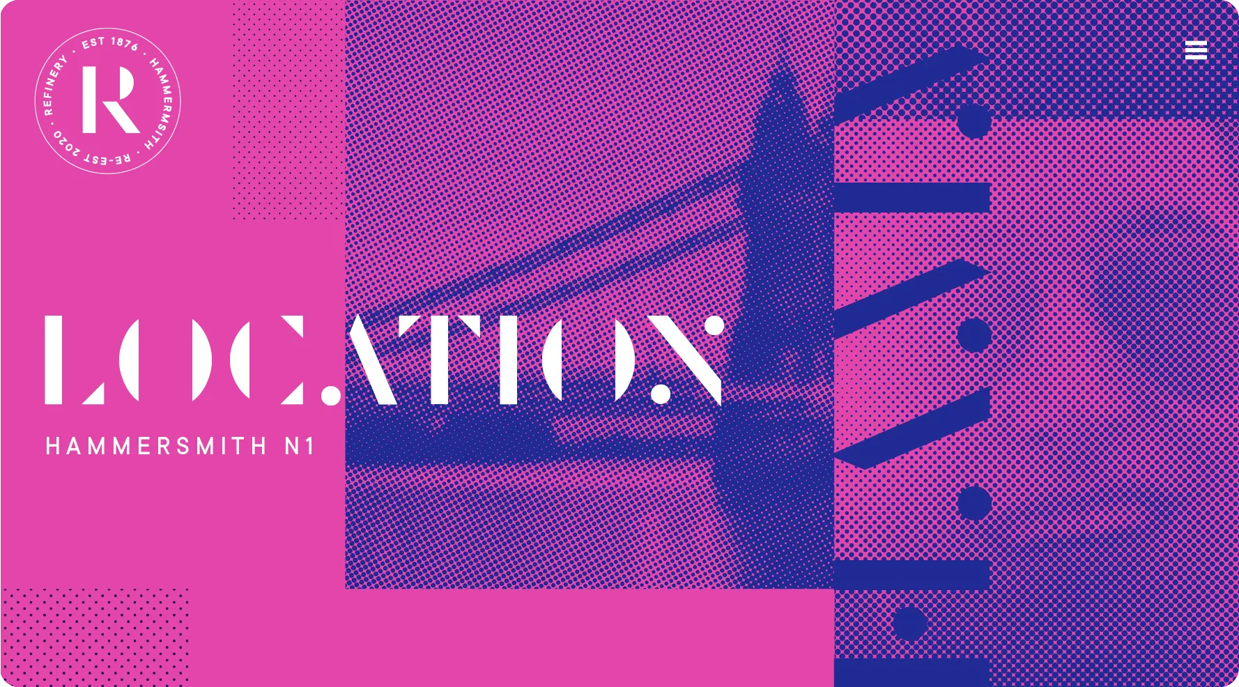
A bespoke display typeface was created by removing as much of the individual letters as possible without impacting legibility.
A bespoke display typeface was created by removing as much of the individual letters as possible without impacting legibility.
A bespoke display typeface was created by removing as much of the individual letters as possible without impacting legibility.
Icons referencing the on-site and local amentites were created. The halftone pattern is used as subtle texture for shading, giving the icons depth and a unique on-brand look.
Icons referencing the on-site and local amentites were created. The halftone pattern is used as subtle texture for shading, giving the icons depth and a unique on-brand look.
Icons referencing the on-site and local amentites were created. The halftone pattern is used as subtle texture for shading, giving the icons depth and a unique on-brand look.
Icons referencing the on-site and local amentites were created. The halftone pattern is used as subtle texture for shading, giving the icons depth and a unique on-brand look.
Icons referencing the on-site and local amentites were created. The halftone pattern is used as subtle texture for shading, giving the icons depth and a unique on-brand look.
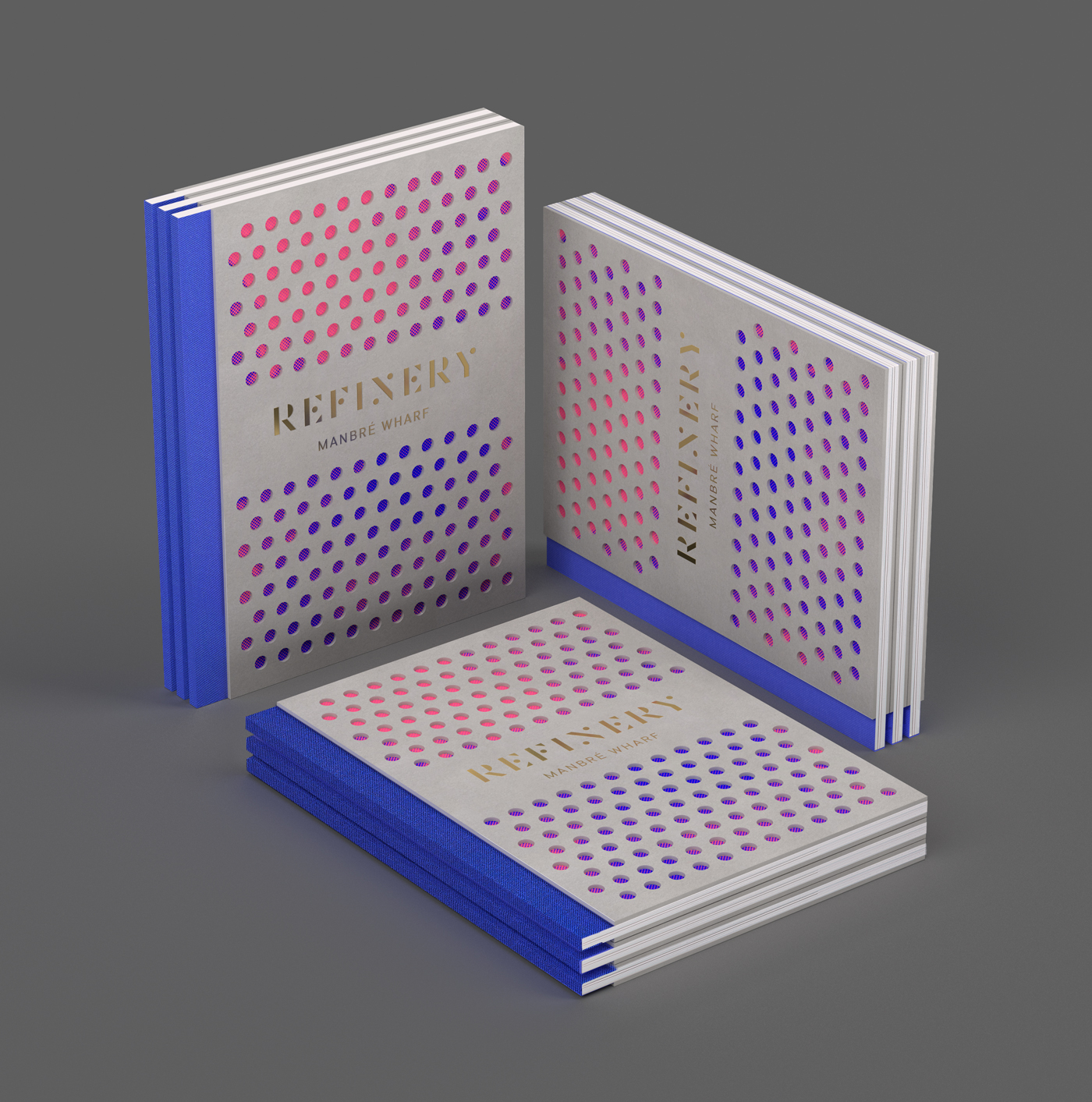
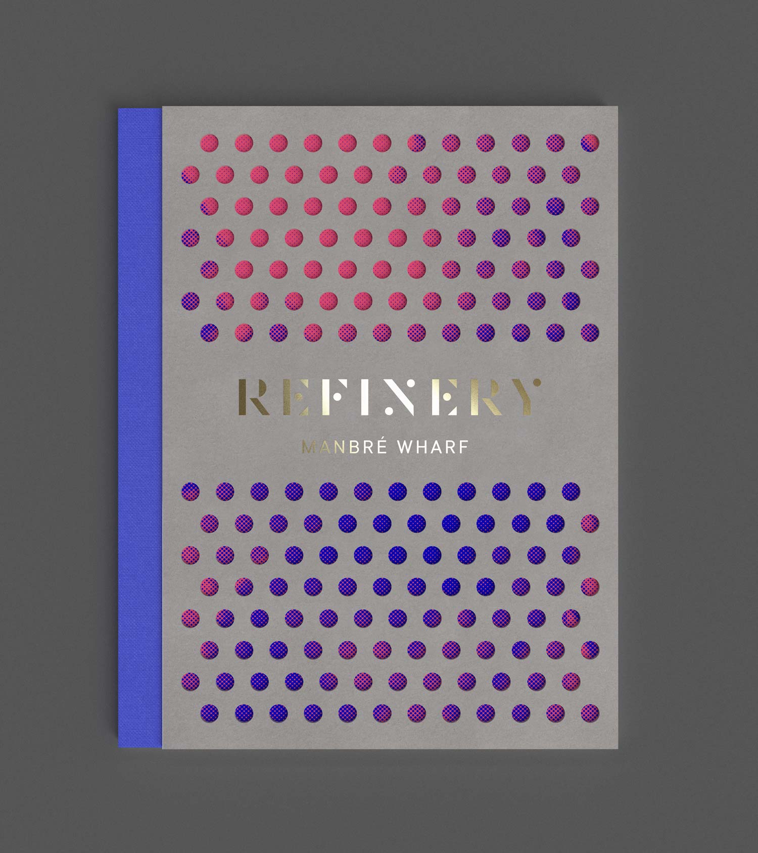
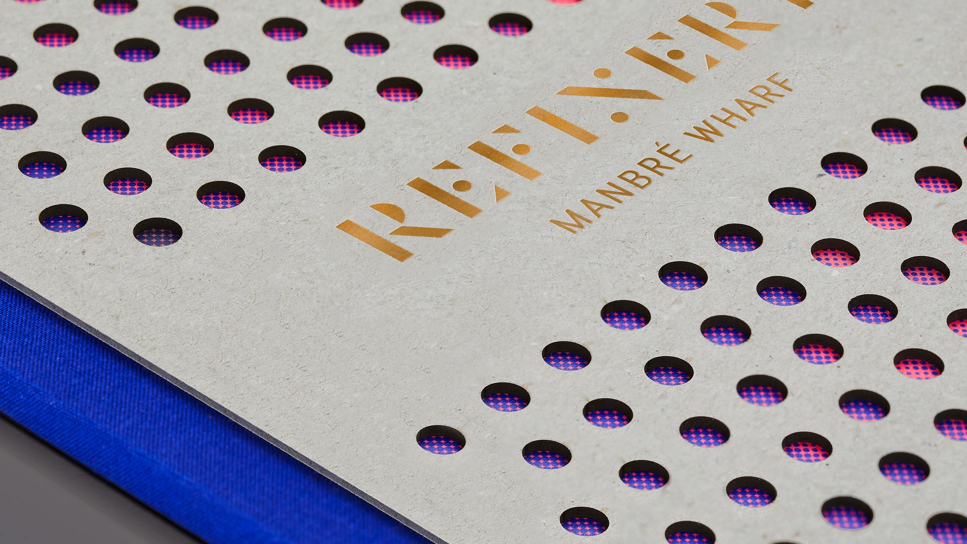
A printed brochure uses the brands pattern to punch holes out of a heavy greyboard cover, revealing a colourful pattern underneath. A blue cloth spine references the riverside location.
A printed brochure uses the brands pattern to punch holes out of a heavy greyboard cover, revealing a colourful pattern underneath. A blue cloth spine references the riverside location.
A printed brochure uses the brands pattern to punch holes out of a heavy greyboard cover, revealing a colourful pattern underneath. A blue cloth spine references the riverside location.
A printed brochure uses the brands pattern to punch holes out of a heavy greyboard cover, revealing a colourful pattern underneath. A blue cloth spine references the riverside location.
A printed brochure uses the brands pattern to punch holes out of a heavy greyboard cover, revealing a colourful pattern underneath. A blue cloth spine references the riverside location.
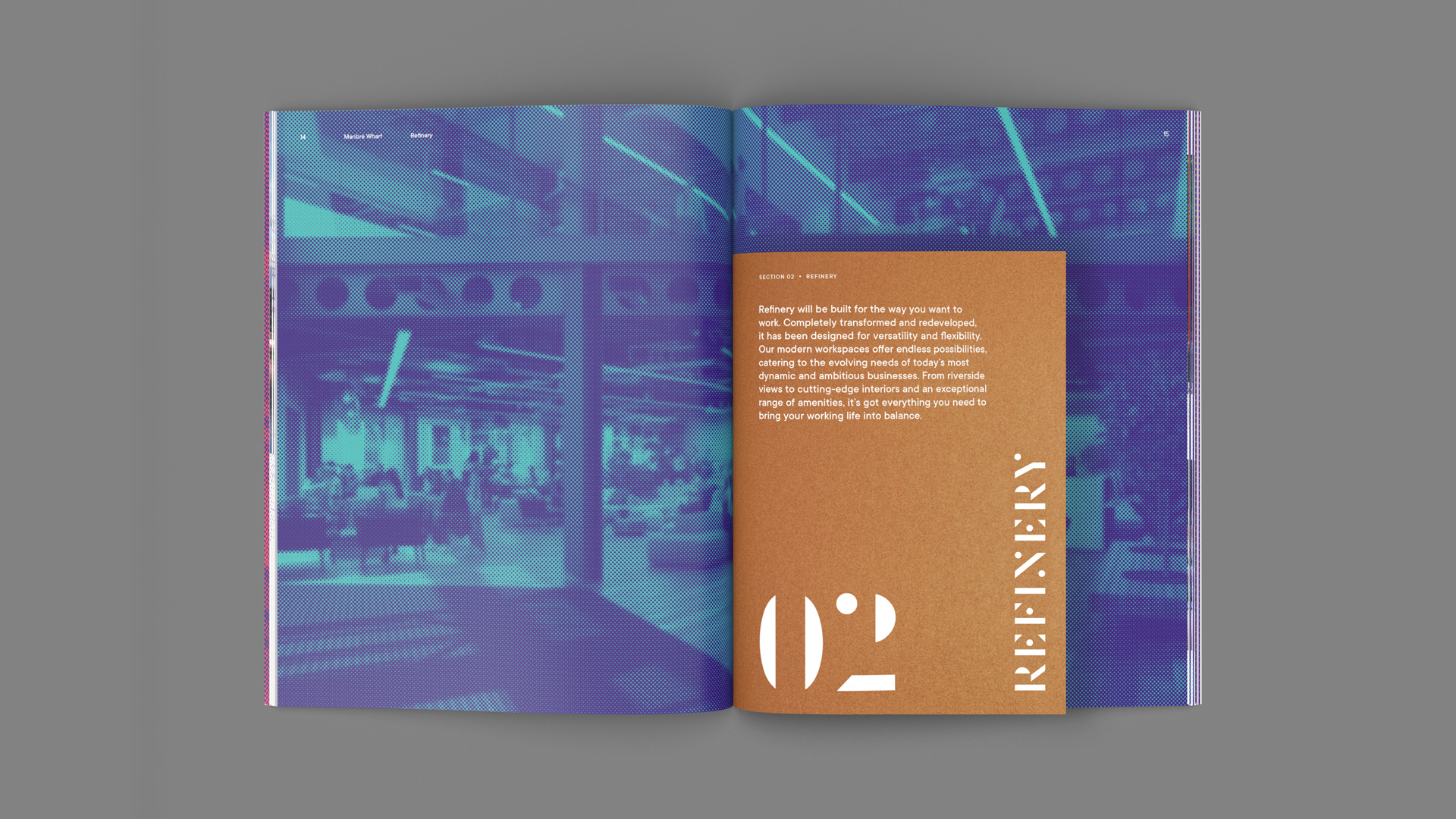
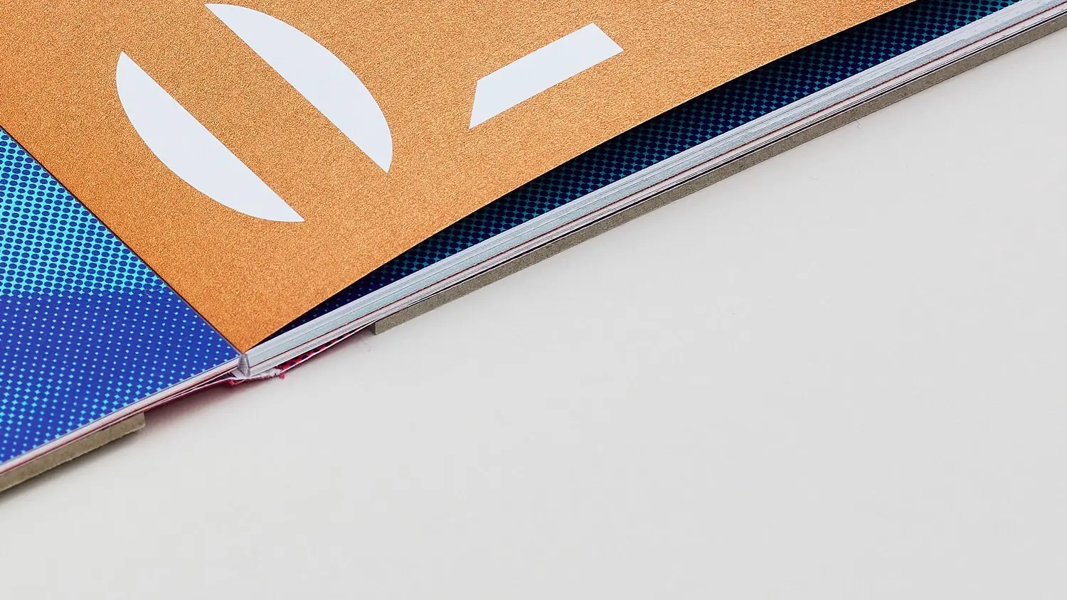
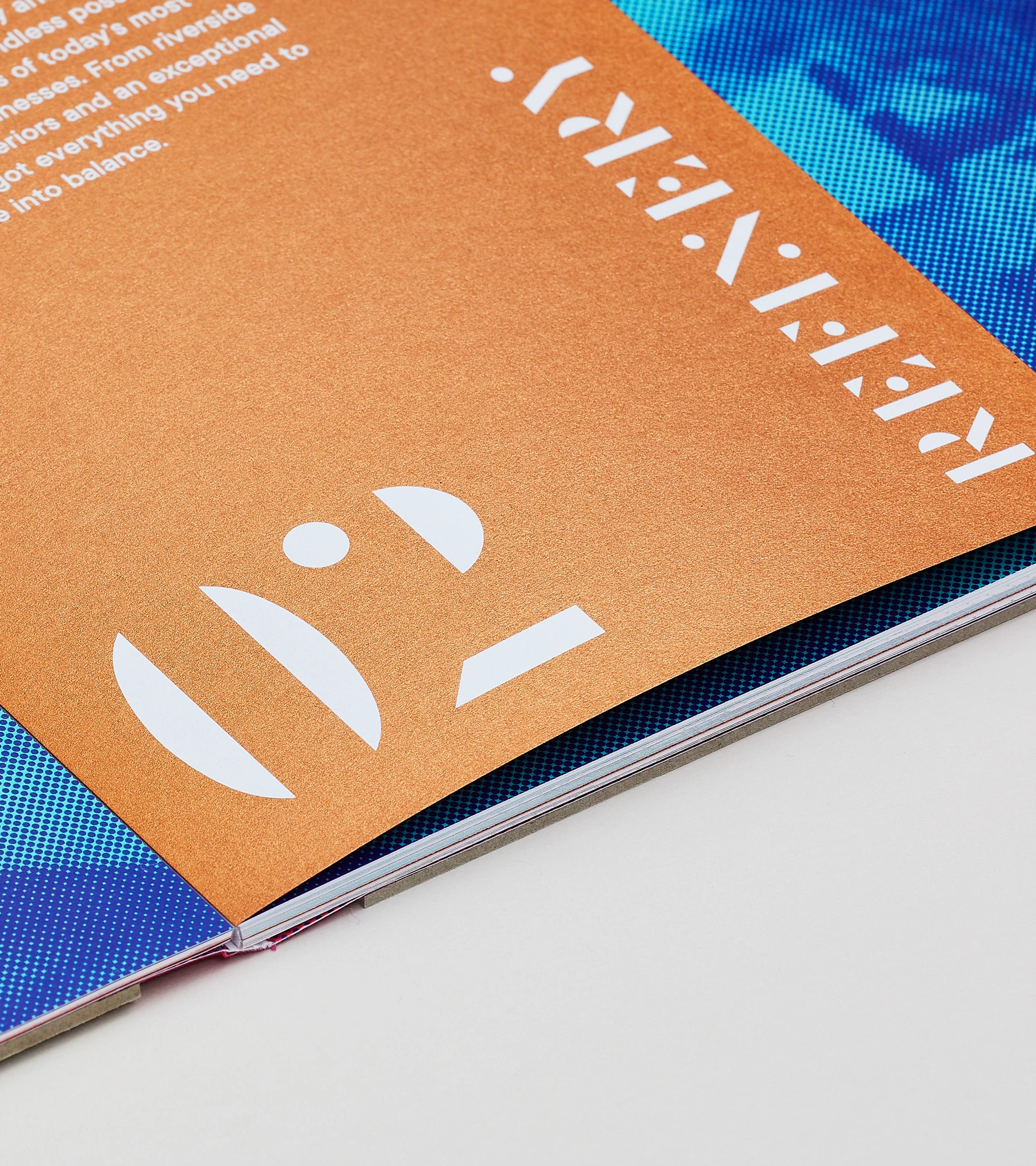
Halftone imagery is featured prominantly as chapter openings thorughout the brochure. Short pages made form copper metalic paper can be turned to reveal more of the image.
Halftone imagery is featured prominantly as chapter openings thorughout the brochure. Short pages made form copper metalic paper can be turned to reveal more of the image.
Halftone imagery is featured prominantly as chapter openings thorughout the brochure. Short pages made form copper metalic paper can be turned to reveal more of the image.
Halftone imagery is featured prominantly as chapter openings thorughout the brochure. Short pages made form copper metalic paper can be turned to reveal more of the image.
Halftone imagery is featured prominantly as chapter openings thorughout the brochure. Short pages made form copper metalic paper can be turned to reveal more of the image.
A printed brochure uses the brands pattern to punch holes out of a heavy greyboard cover, revealing a colourful pattern underneath. A blue cloth spine references the riverside location.
A printed brochure uses the brands pattern to punch holes out of a heavy greyboard cover, revealing a colourful pattern underneath. A blue cloth spine references the riverside location.
A printed brochure uses the brands pattern to punch holes out of a heavy greyboard cover, revealing a colourful pattern underneath. A blue cloth spine references the riverside location.
Halftone imagery is featured prominantly as chapter openings thorughout the brochure. Short pages made form copper metalic paper can be turned to reveal more of the image.
To support the ripple graphic elements I also developed a system for writing topline messaging inspired by the theme of transformation
Halftone imagery is featured prominantly as chapter openings thorughout the brochure. Short pages made form copper metalic paper can be turned to reveal more of the image.
A printed brochure uses the brands pattern to punch holes out of a heavy greyboard cover, revealing a colourful pattern underneath. A blue cloth spine references the riverside location.
A printed brochure uses the brands pattern to punch holes out of a heavy greyboard cover, revealing a colourful pattern underneath. A blue cloth spine references the riverside location.
Halftone imagery is featured prominantly as chapter openings thorughout the brochure. Short pages made form copper metalic paper can be turned to reveal more of the image.
To support the ripple graphic elements I also developed a system for writing topline messaging inspired by the theme of transformation
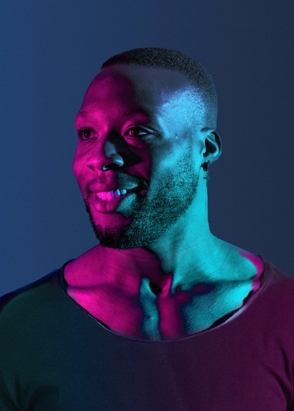


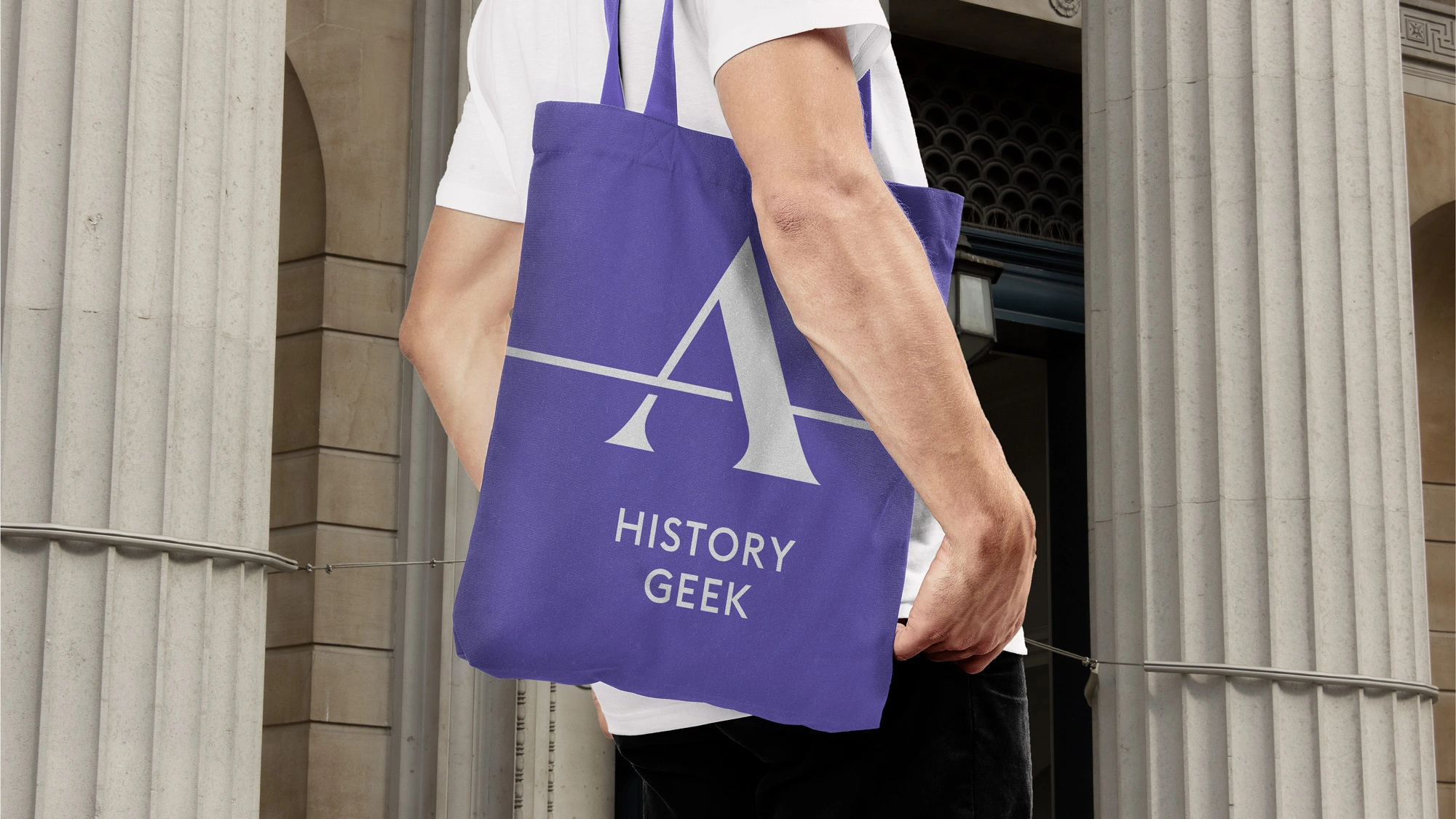
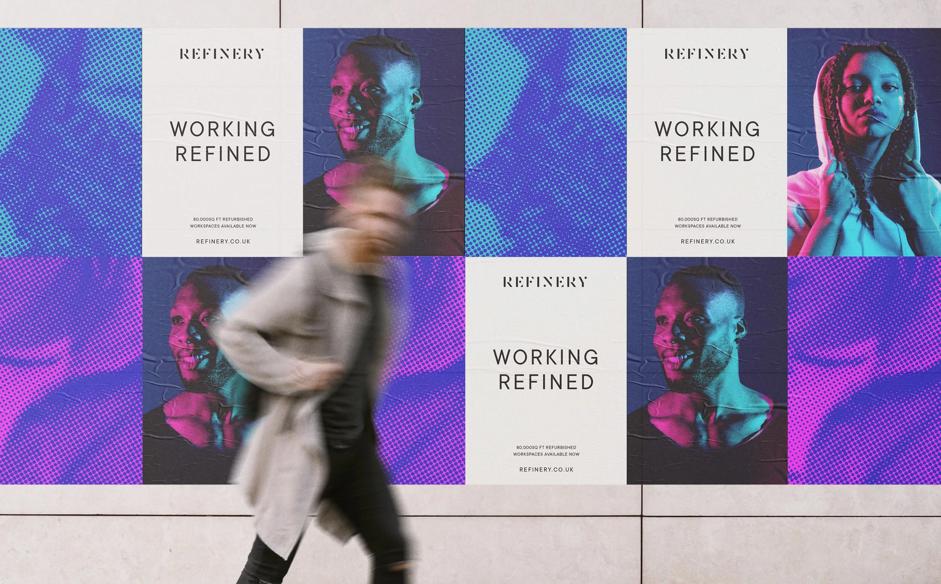
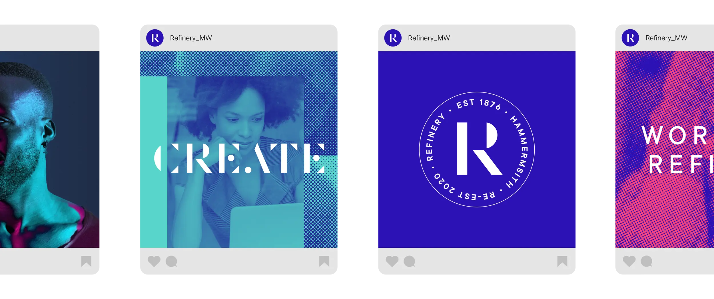
A campaign tiled 'Working Refined' was run promoting the completion of the refurbishment works. Models representing a new generation of business owners were photographed with gel lighting featuring the brands colour palette.
A campaign tiled 'Working Refined' was run promoting the completion of the refurbishment works. Models representing a new generation of business owners were photographed with gel lighting featuring the brands colour palette.
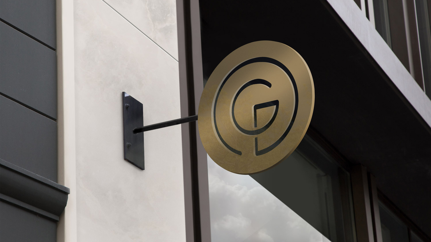
London-based property developer Groveworld specialise in transforming problematic, derelict sites across the city into high-end, sustainable mixed use developments with green-spaces for public use. Once completed they are a catalyst for transforming and improving the local area. Working at Blast I created a I created an identity inspired by the idea of a ripple effect.
A campaign tiled 'Working Refined' was run promoting the completion of the refurbishment works. Models representing a new generation of business owners were photographed with gel lighting featuring the brands colour palette.
London-based property developer Groveworld specialise in transforming problematic, derelict sites across the city into high-end, sustainable mixed use developments with green-spaces for public use. Once completed they are a catalyst for transforming and improving the local area. Working at Blast I created a I created an identity inspired by the idea of a ripple effect.
Have a project in mind? Please get in touch!
Have a project in mind? Please get in touch!