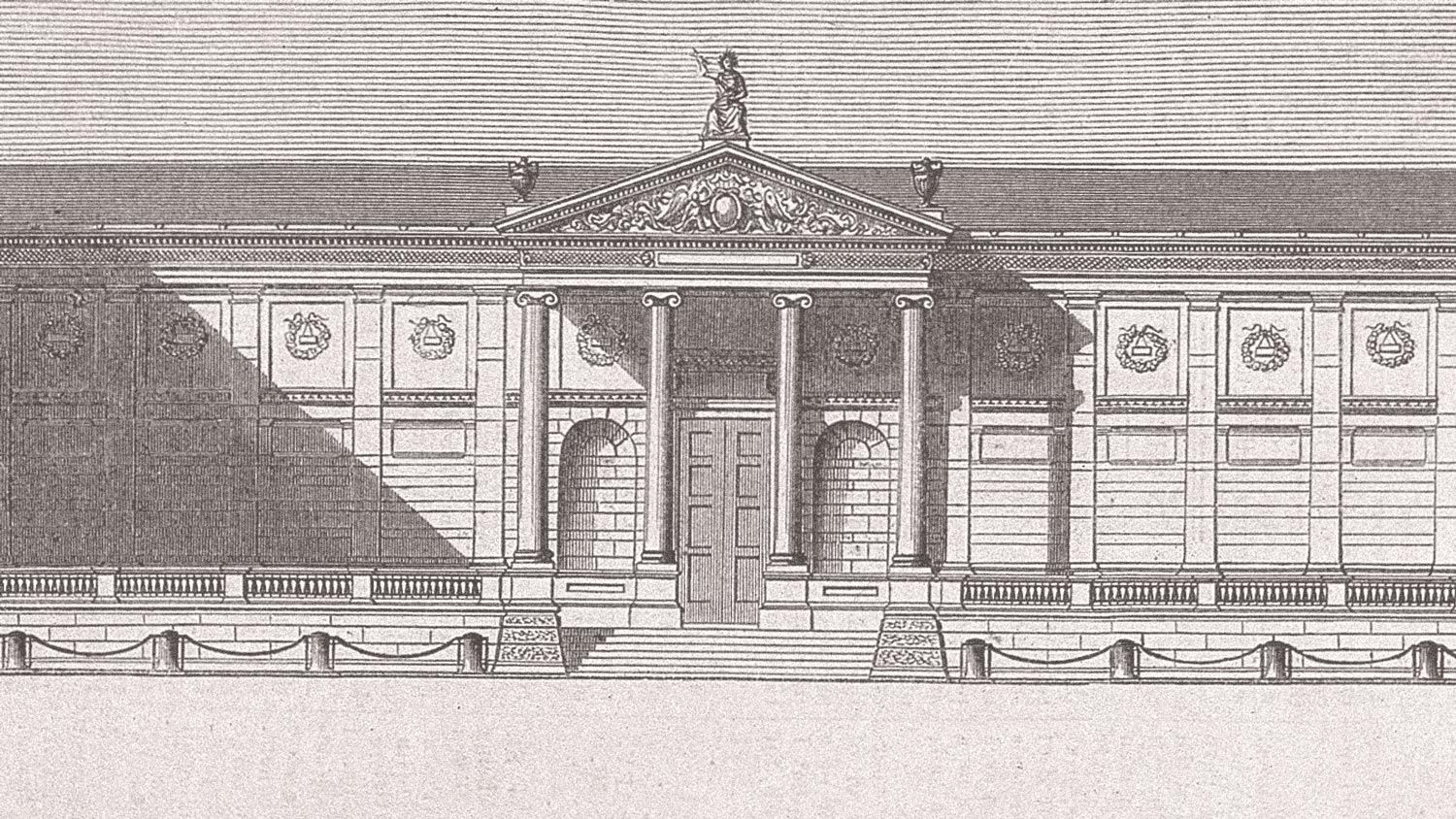
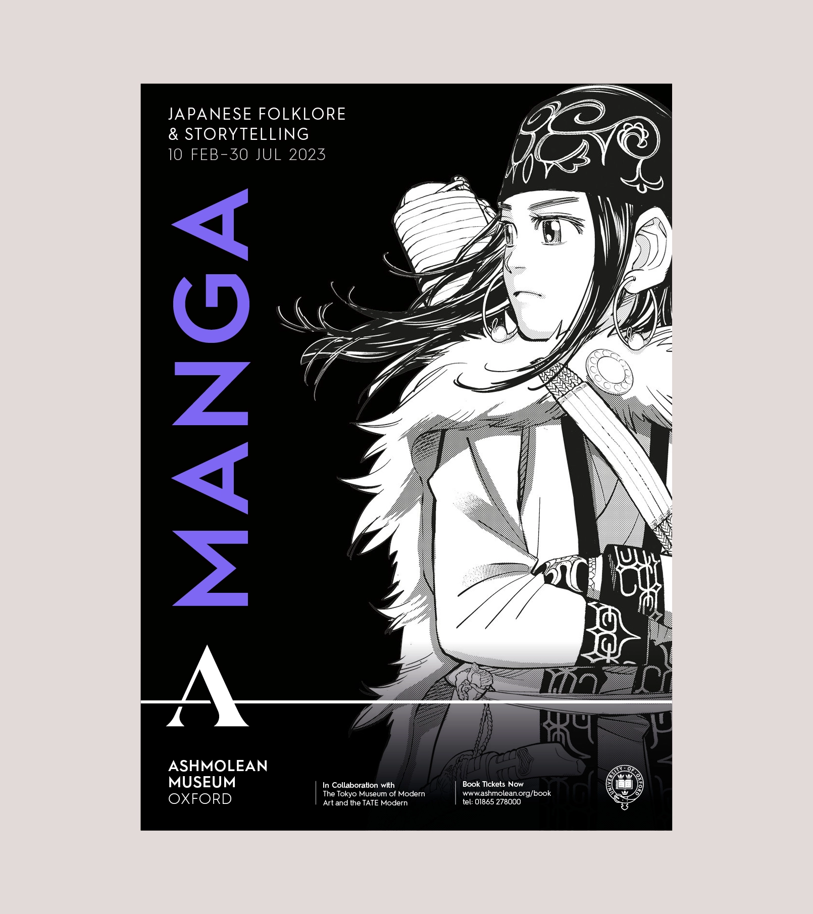
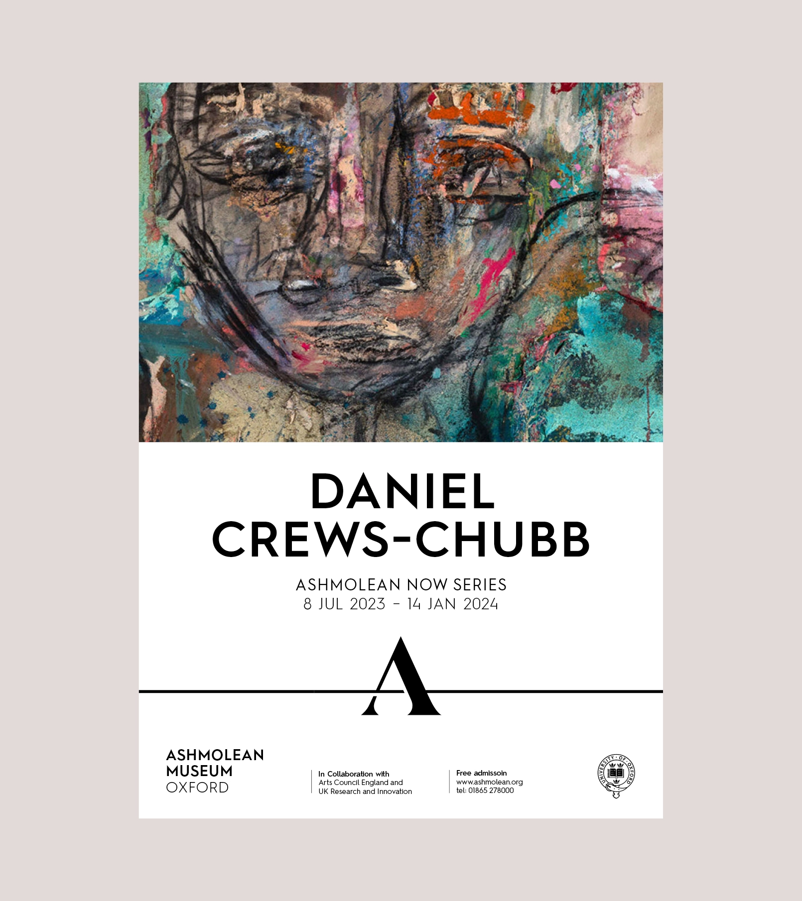
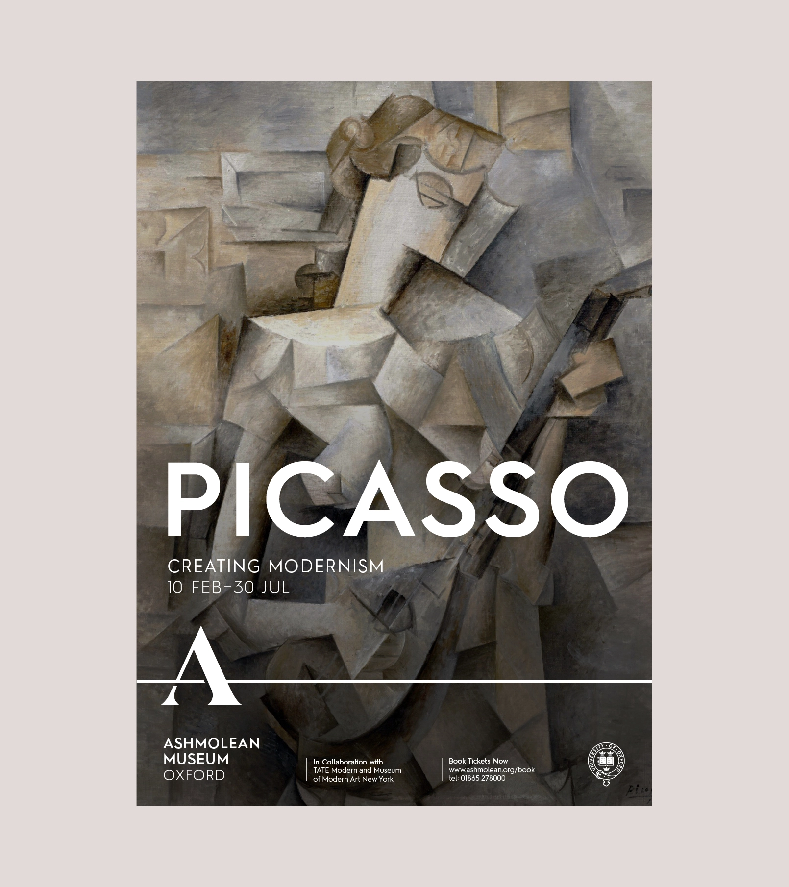
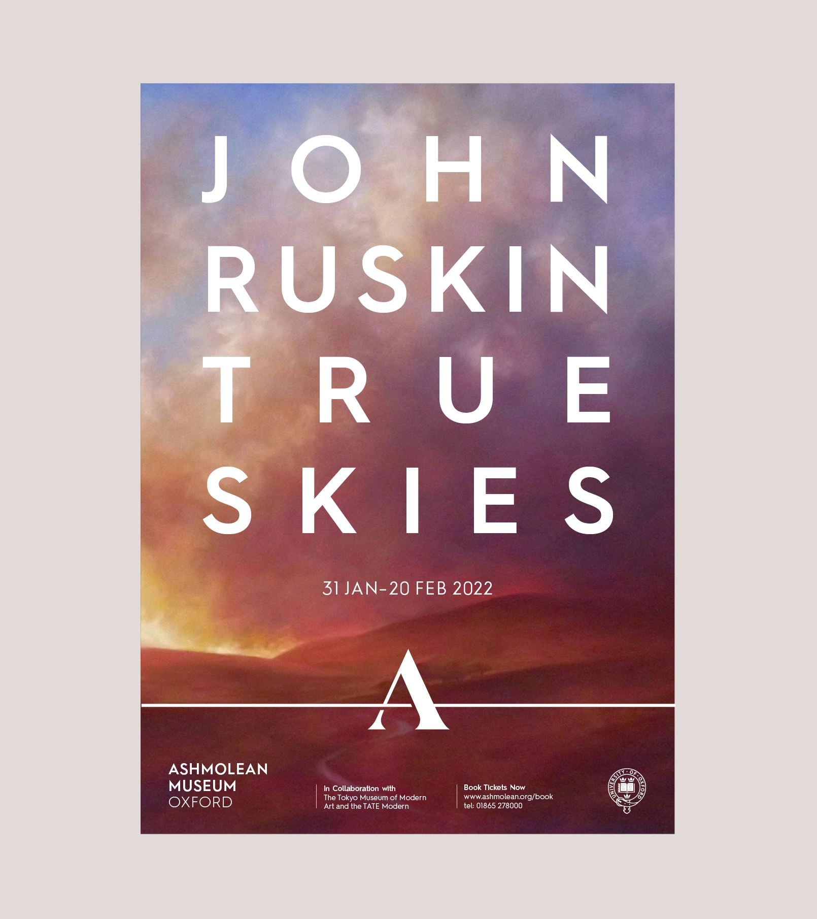
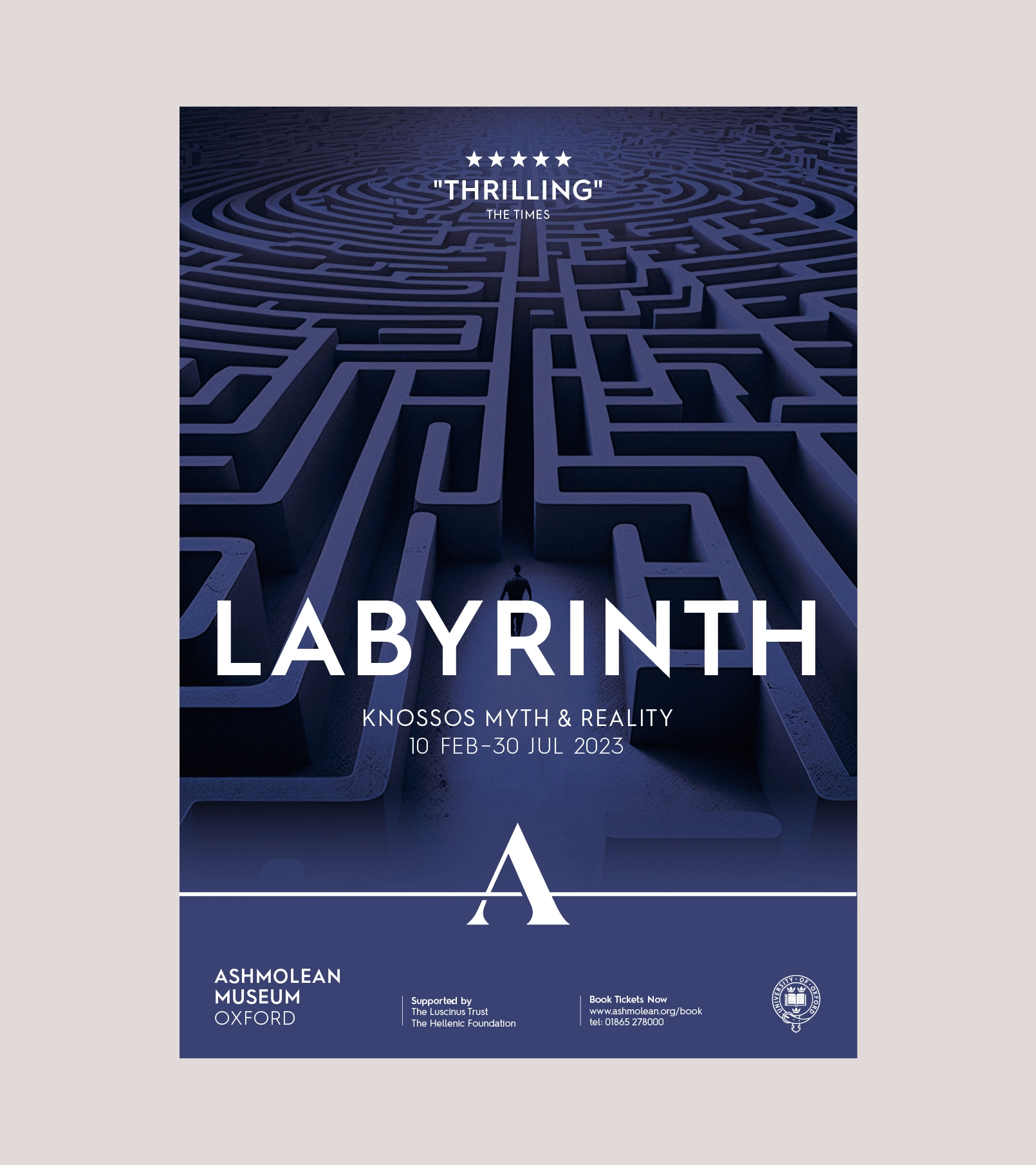
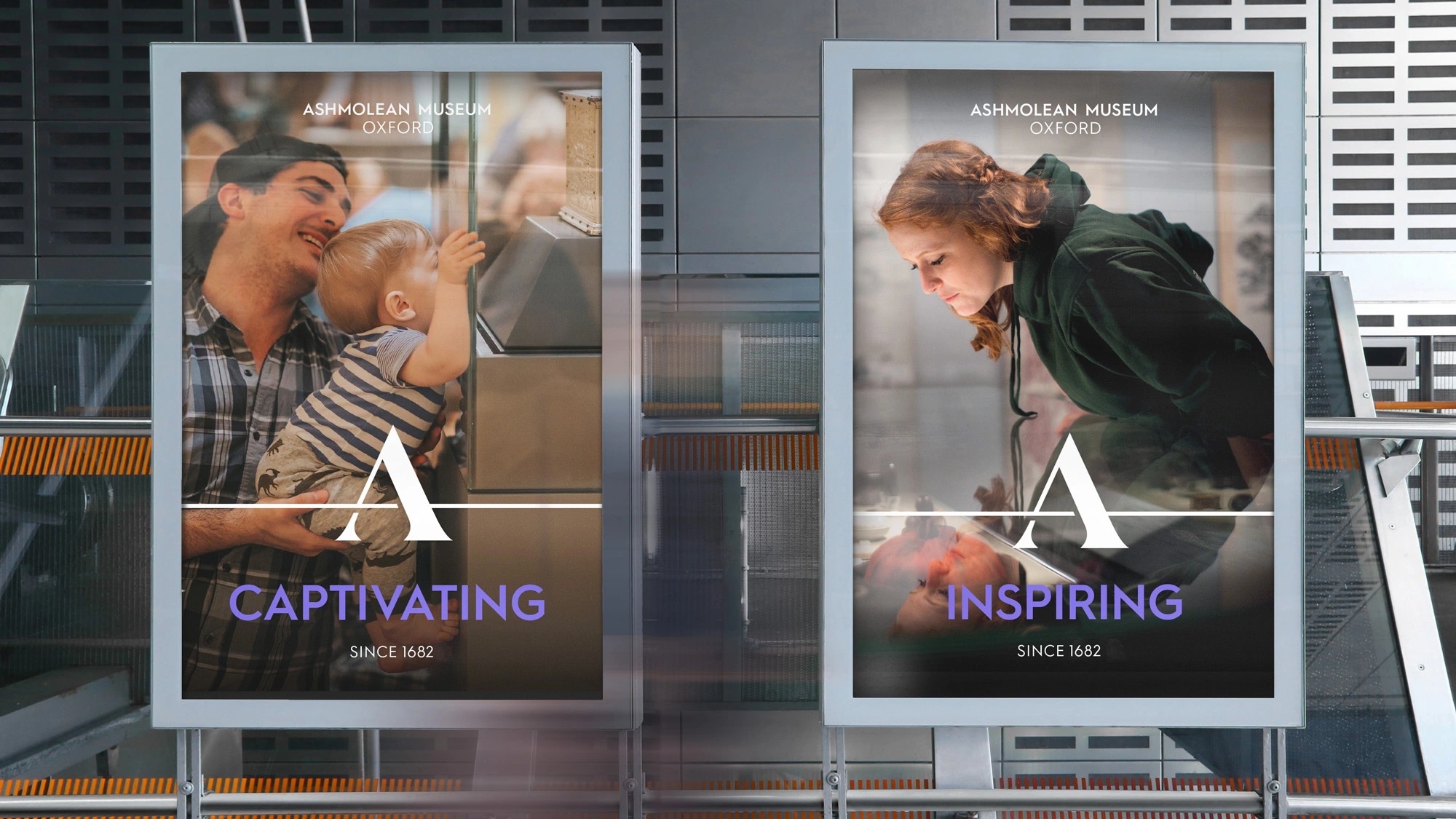
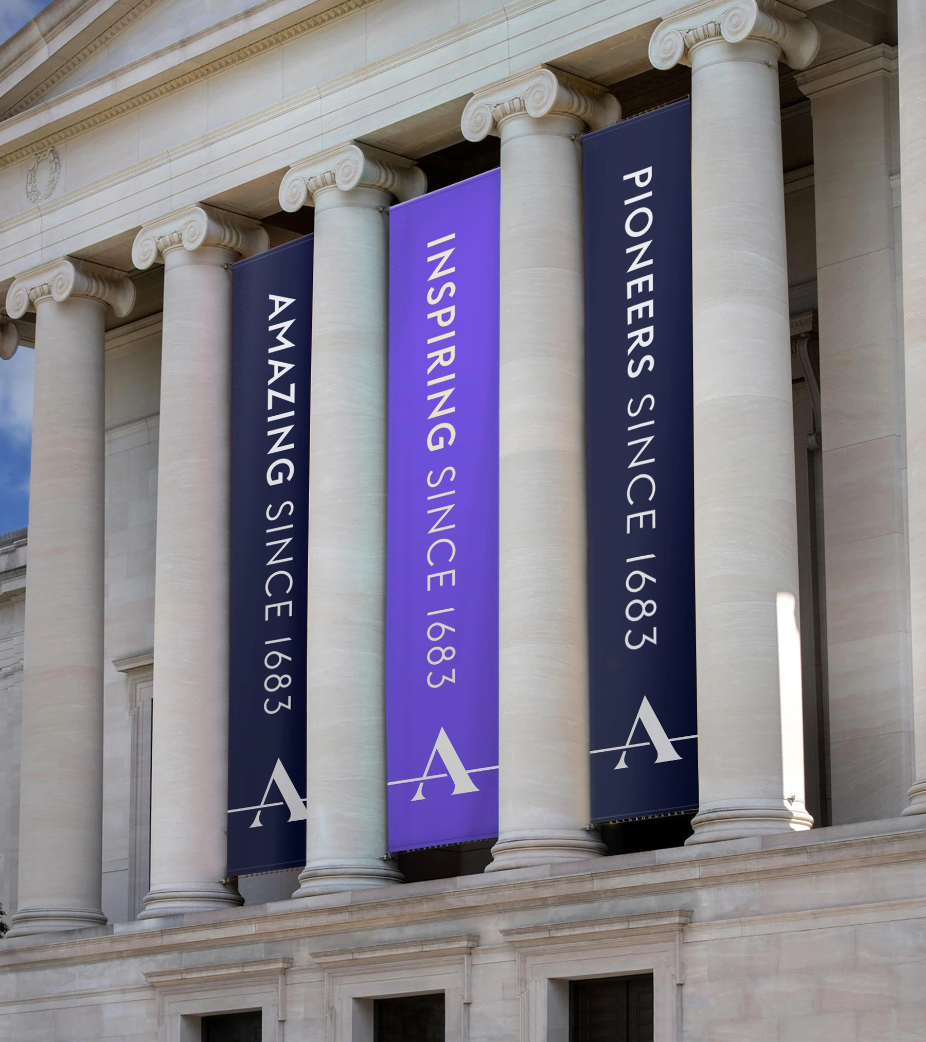
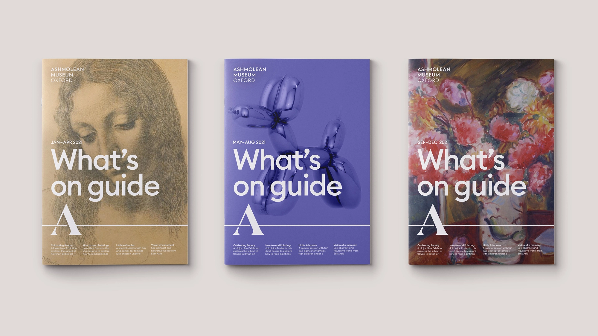
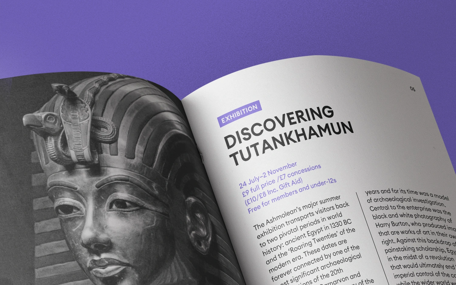
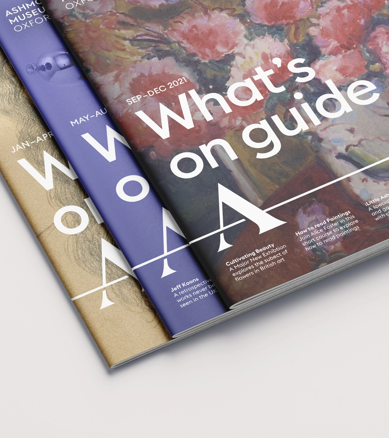
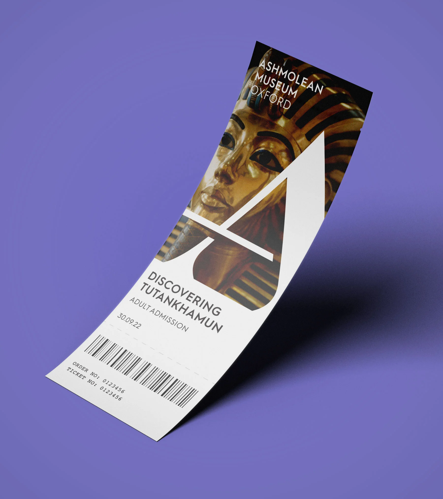
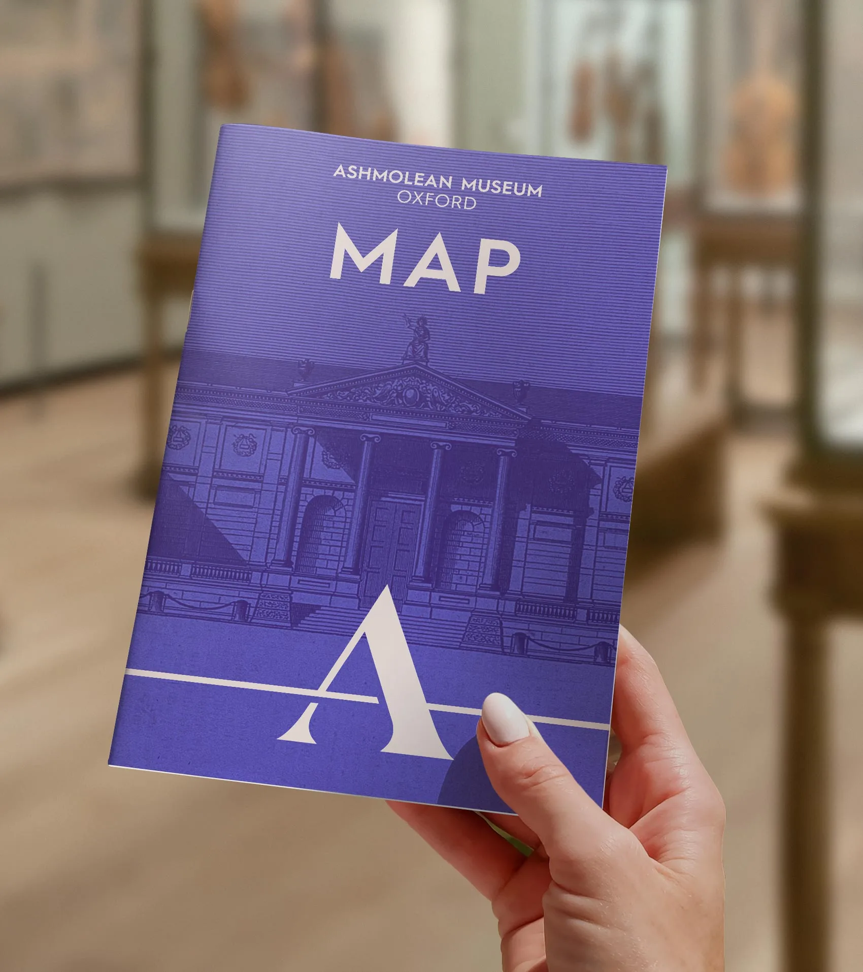
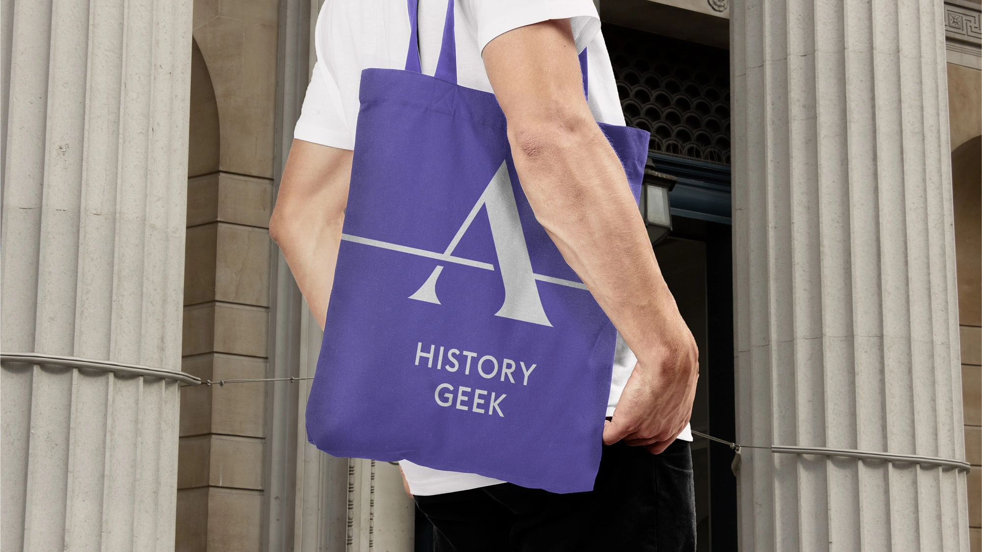
Ashmolean Museum Oxford
Croxley Park
REBRANDING THE WORLD'S
FIRST PUBLIC MUSEUM
Croxley Park believe that happy people build successful companies. This business park offers not just spacious, modern workspaces, but unrivalled on-site amenities. All this makes Croxley Park more than just a place to work.
Croxley Park believe that happy people build successful companies. This business park offers not just spacious, modern workspaces, but unrivalled on-site amenities. All this makes Croxley Park more than just a place to work.
Croxley Park believe that happy people build successful companies. This Watford-based business park combines excellent workspaces with unrivaled amenties.
Croxley Park believe that happy people build successful companies. This Watford-based business park has been developed to provide spacious modern workspaces and unrivalled work/life balance though excellent on-site amenities, 72 acres green surroundings and a comprehensive after work events programme. All this makes Croxley Park more than just a place to work.
Croxley Park believe that happy people build successful companies. This Watford-based business park has been developed to provide spacious modern workspaces and unrivalled work/life balance though excellent on-site amenities, 72 acres green surroundings and a comprehensive after work events programme. All this makes Croxley Park more than just a place to work.
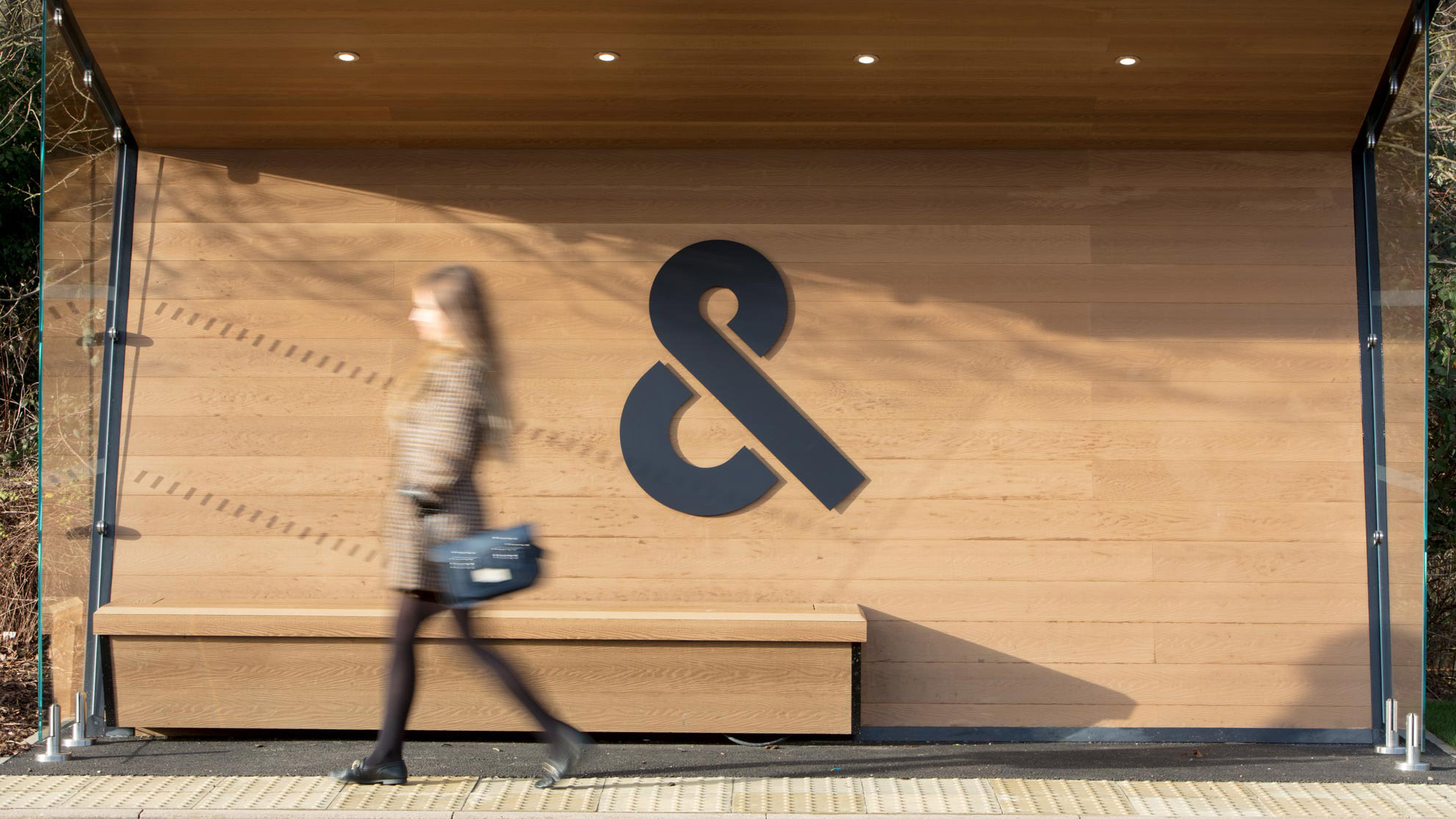
My concept ‘Business & more’ encapsulates this idea, communicating all the added benefits of the park through a series of creative copy lines. The ‘& more’ concept is reinforced with a new logo, which forms an ampersand from the Croxley Park initials.
My concept ‘Business & more’ encapsulates this idea, communicating all the added benefits of the park through a series of creative copy lines. The ‘& more’ concept is reinforced with a new logo, which forms an ampersand from the Croxley Park initials.
My concept ‘Business & more’ encapsulates this idea, communicating all the added benefits of the park through a series of creative copy lines. The ‘& more’ concept is reinforced with a new logo, which forms an ampersand from the Croxley Park initials.
My concept ‘Business & more’ encapsulates this idea, communicating all the added benefits of the park through a series of creative copy lines. The ‘& more’ concept is reinforced with a new logo, which forms an ampersand from the Croxley Park initials.
My concept ‘Business & more’ encapsulates this idea, communicating all the added benefits of the park through a series of creative copy lines. The ‘& more’ concept is reinforced with a new logo, which forms an ampersand from the Croxley Park initials.
My concept ‘Business & more’ encapsulates this idea, communicating all the added benefits of the park through a series of creative copy lines. The ‘& more’ concept is reinforced with a new logo, which forms an ampersand from the Croxley Park initials.
My concept ‘Business & more’ encapsulates this idea, communicating all the added benefits of the park through a series of creative copy lines. The ‘& more’ concept is reinforced with a new logo, which forms an ampersand from the Croxley Park initials.
My concept ‘Business & more’ encapsulates this idea, communicating all the added benefits of the park through a series of creative copy lines. The ‘& more’ concept is reinforced with a new logo, which forms an ampersand from the Croxley Park initials.
My concept ‘Business & more’ encapsulates this idea, communicating all the added benefits of the park through a series of creative copy lines. The ‘& more’ concept is reinforced with a new logo, which forms an ampersand from the Croxley Park initials.
My concept ‘Business & more’ encapsulates this idea, communicating all the added benefits of the park through a series of creative copy lines. The ‘& more’ concept is reinforced with a new logo, which forms an ampersand from the Croxley Park initials.
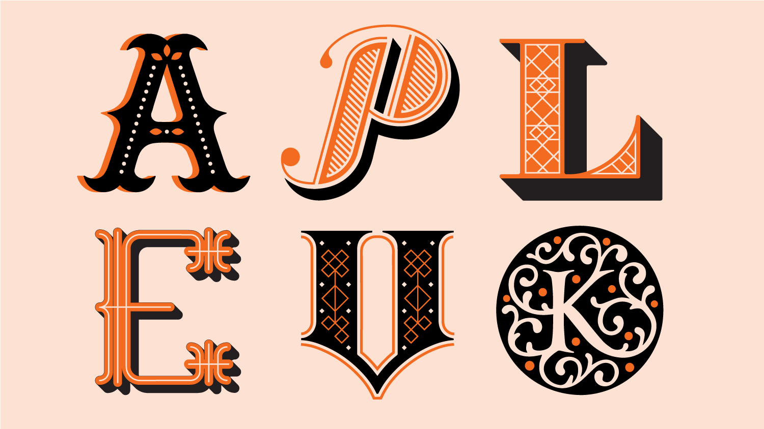
I designed a full bespoke typeface based on the stenciled logo to add ownership to written messaging throughout the brand identity
I designed a full bespoke typeface based on the stenciled logo to add ownership to written messaging throughout the brand identity
I designed a full bespoke typeface based on the stenciled logo to add ownership to written messaging throughout the brand identity
I designed a full bespoke typeface based on the stenciled logo to add ownership to written messaging throughout the brand identity
I designed a full bespoke typeface based on the stenciled logo to add ownership to written messaging throughout the brand identity
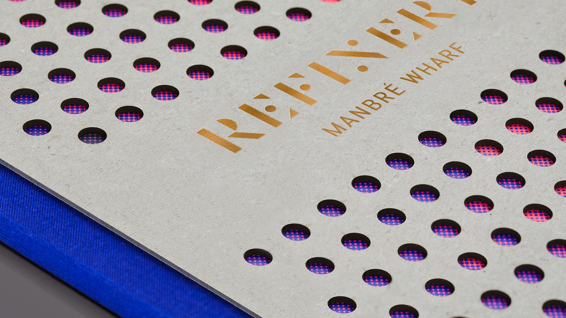
The brand concept is carried over to physical marketing, with a building completion brochure split into two distinct sections. The first half promoting the newly built workspace, with the second communicating the added benifits of the park.
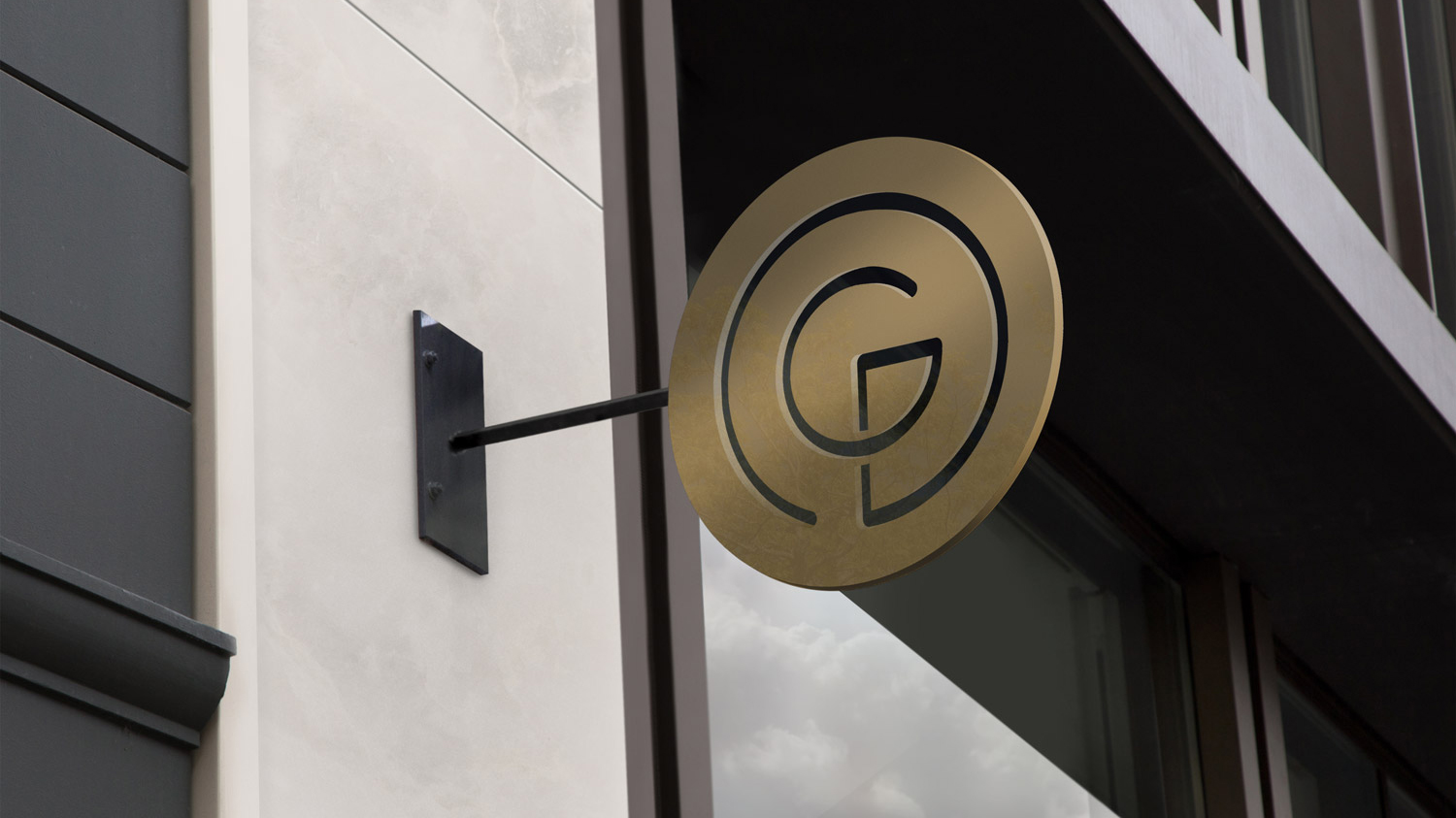
The brands logo is inspired by this ripple aesthetic. The mark combines a monogram G, a tree representing the eponymous Grove all housed within a wider circular device representing the world. All elemets are tied together with a single line representing Groveworlds seamless process.
The brand concept is carried over to physical marketing, with a building completion brochure split into two distinct sections. The first half promoting the newly built workspace, with the second communicating the added benifits of the park.
The brand concept is carried over to physical marketing, with a building completion brochure split into two distinct sections. The first half promoting the newly built workspace, with the second communicating the added benifits of the park.
London-based property developer Groveworld specialise in transforming problematic, derelict sites across the city into high-end, sustainable mixed use developments with green-spaces for public use. Once completed they are a catalyst for transforming and improving the local area. Working at Blast I created a I created an identity inspired by the idea of a ripple effect.
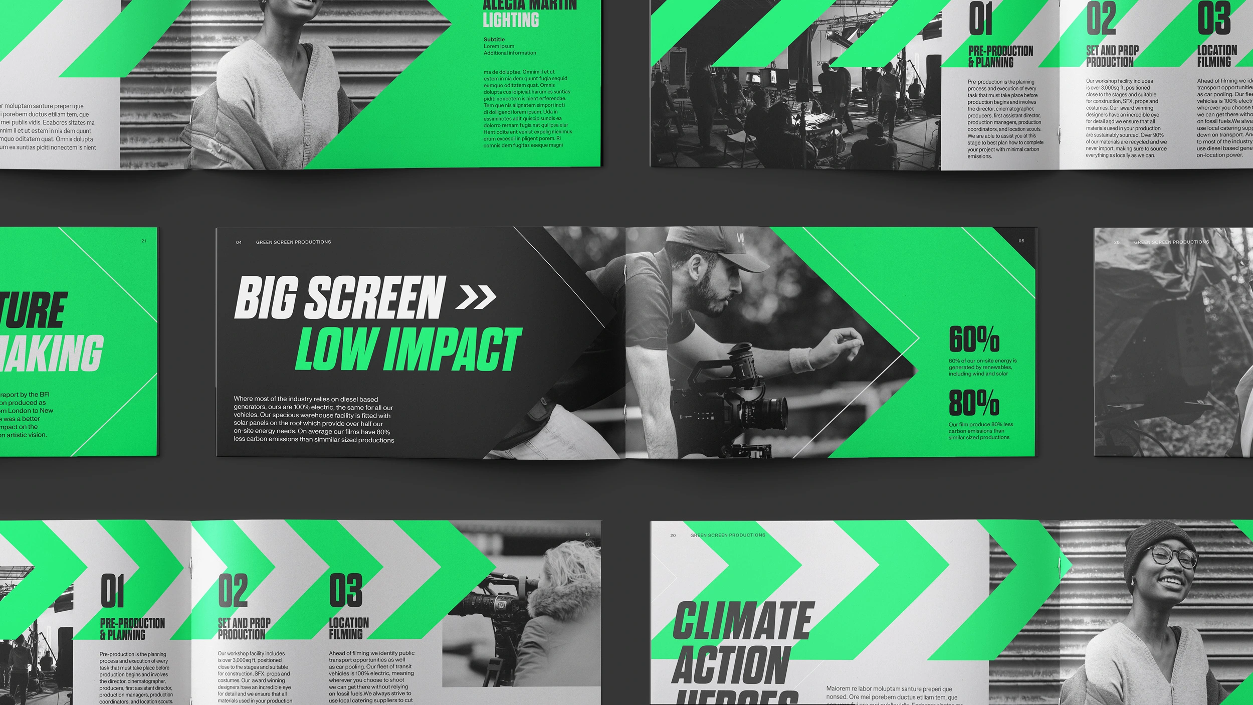
An icon style was established based on the stenciled look of the brand logo. Icons represent all aspects of park life.
An icon style was established based on the stenciled look of the brand logo. Icons represent all aspects of park life.
An icon style was established based on the stenciled look of the brand logo. Icons represent all aspects of park life.
An icon style was established based on the stenciled look of the brand logo. Icons represent all aspects of park life.
The brand concept is carried over to physical marketing, with a building completion brochure split into two distinct sections. The first half promoting the newly built workspace, with the second communicating the added benifits of the park.
The brands logo is inspired by this ripple aesthetic. The mark combines a monogram G, a tree representing the eponymous Grove all housed within a wider circular device representing the world. All elemets are tied together with a single line representing Groveworlds seamless process.
The brand concept is carried over to physical marketing, with a building completion brochure split into two distinct sections. The first half promoting the newly built workspace, with the second communicating the added benifits of the park.
The brand concept is carried over to physical marketing, with a building completion brochure split into two distinct sections. The first half promoting the newly built workspace, with the second communicating the added benifits of the park.
London-based property developer Groveworld specialise in transforming problematic, derelict sites across the city into high-end, sustainable mixed use developments with green-spaces for public use. Once completed they are a catalyst for transforming and improving the local area. Working at Blast I created a I created an identity inspired by the idea of a ripple effect.
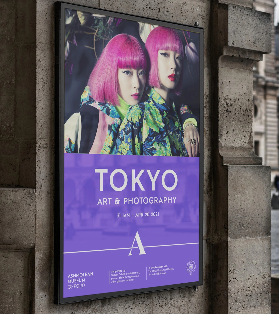
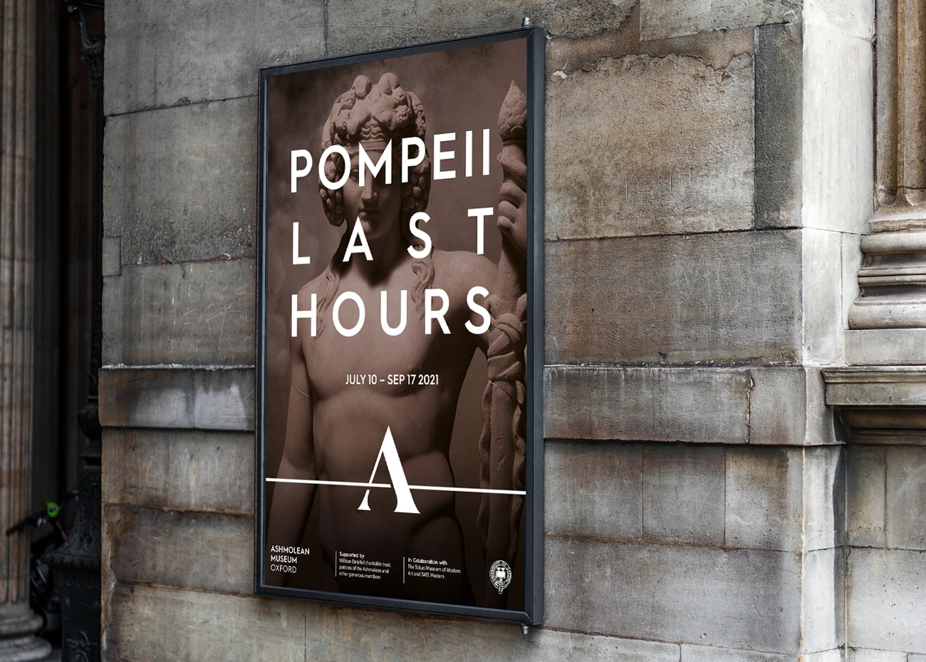
“We have been impressed with the ability to both understand our needs and to come up with intelligent and creative solutions. We are thrilled at how our new brand identity reflects both the Ashmolean’s history and our vision for the future."
Theresa Nicolson, Marketing Manager
Ashmolean Museum Oxford
The brands logo is inspired by this ripple aesthetic. The mark combines a monogram G, a tree representing the eponymous Grove all housed within a wider circular device representing the world. All elemets are tied together with a single line representing Groveworlds seamless process.
The brand concept is carried over to physical marketing, with a building completion brochure split into two distinct sections. The first half promoting the newly built workspace, with the second communicating the added benifits of the park.
The brand concept is carried over to physical marketing, with a building completion brochure split into two distinct sections. The first half promoting the newly built workspace, with the second communicating the added benifits of the park.
London-based property developer Groveworld specialise in transforming problematic, derelict sites across the city into high-end, sustainable mixed use developments with green-spaces for public use. Once completed they are a catalyst for transforming and improving the local area. Working at Blast I created a I created an identity inspired by the idea of a ripple effect.
Have a project in mind? Please get in touch!
Have a project in mind? Please get in touch!